
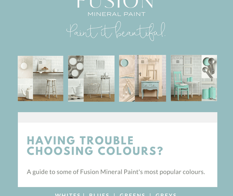
FAQ – What are the differences between the various colour shades in the Fusion range?
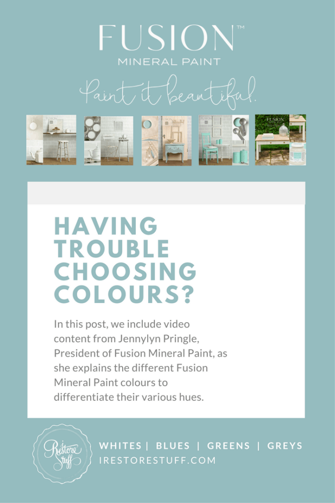
I’m often asked about the differences in the Fusion colours if a customer is ordering online, especially with the whites, as it is a little more difficult to tell them apart unless they are side by side. Jennylyn from Fusion Mineral Paint has created these great videos showcasing the colours in the Fusion line and painting them out on pure white paper so you can see the true colour differences (note: videos don’t include the newest colours from 2016)
I have summarised descriptions of each colour above the videos. I hope you find this helpful in choosing the best colour for your needs.
We have each of these colour collages displayed in our product section, but having them side by side with similar colourings like this helps with deciding between the different hues.
** Australian painters, you can purchase any of these colours by clicking on the colour images of your choice to take you to the product.
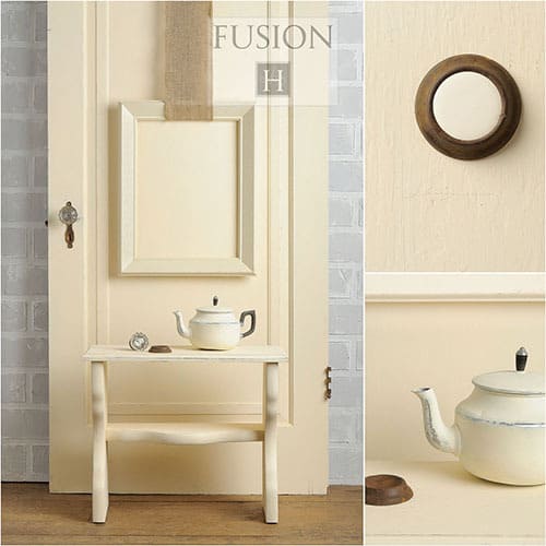
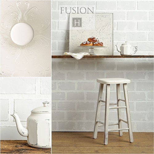
Whites:
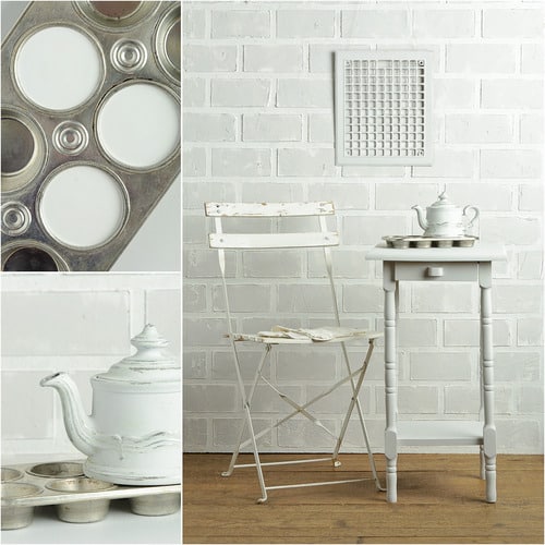
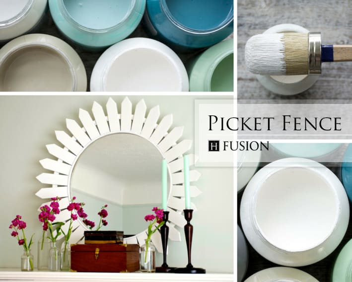
Picket Fence (Michael Penney collection) – brightest white in the line.
Casement – more of a pure white with just the slightest hint of yellow.
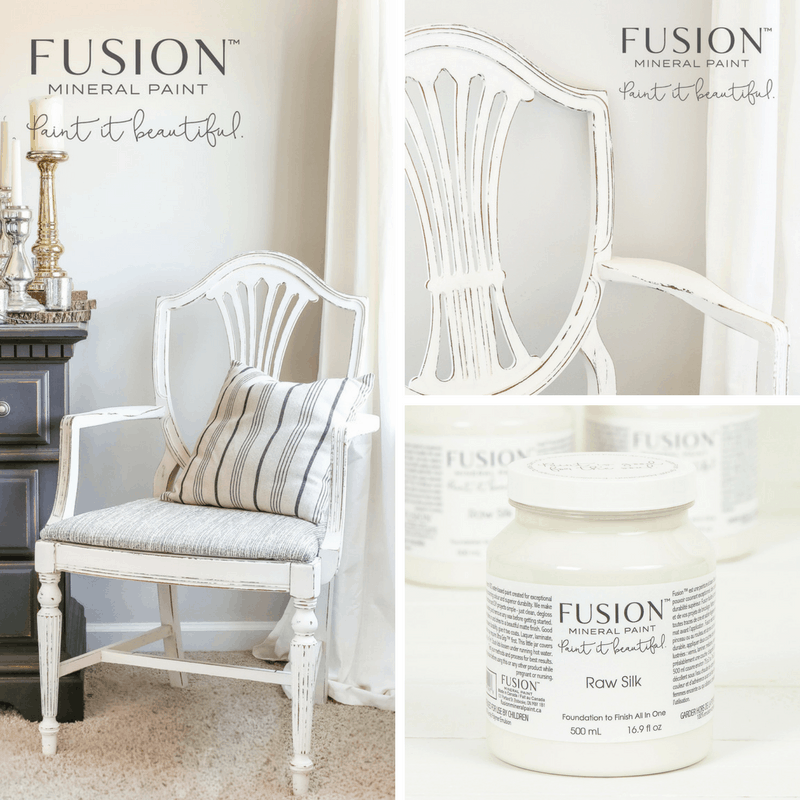
Raw Silk (NEW 2016) – a warm old white with barely a hint of yellow and just a touch of grey. I’d consider this to be between Casement & Lamp White, but leaning closer to Casement.
Limestone – off white with a stronger sense of yellow undertone.
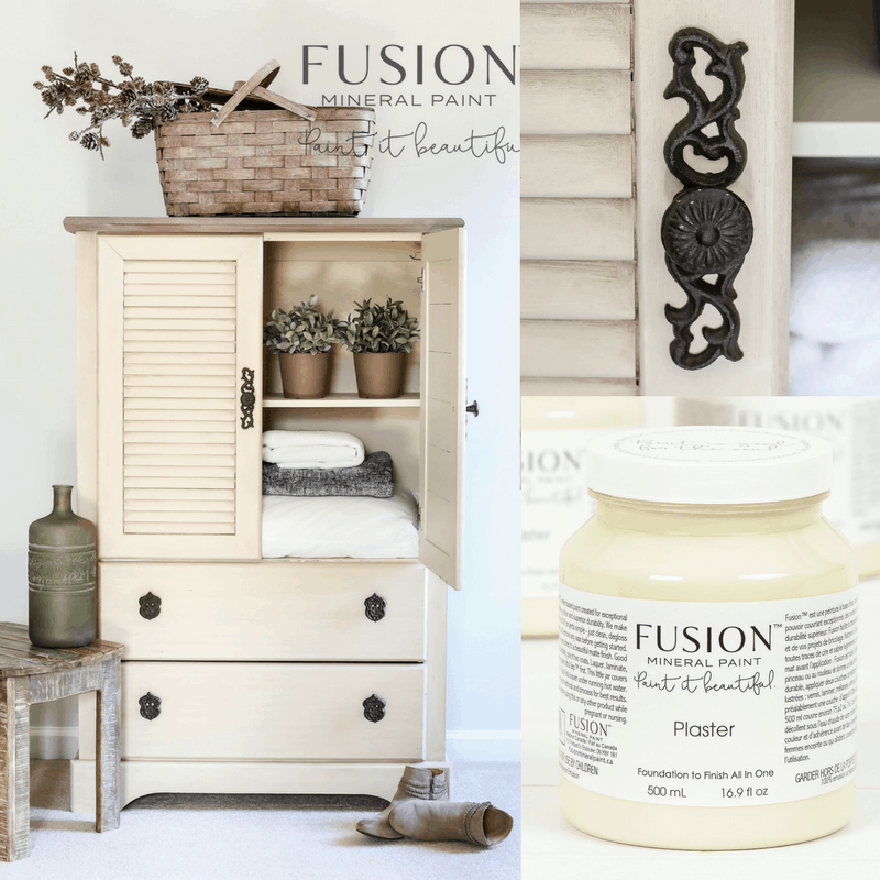
Plaster (NEW 2016) – more yellow undertone than Limestone.
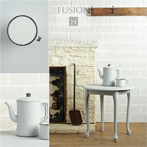
Champlain – neutral white, warm tone, hints of yellow and gray (one of the most popular in the line)
Lamp White – off white with gray undertone.
Note: this video does not contain the new colours, Raw Silk & Plaster

Casement
Limestone
Champlain
Lamp White
Picket Fence
Raw Silk
Plaster
Taupes & Greys:
Sterling – a grey with soft subtle yellow undertones
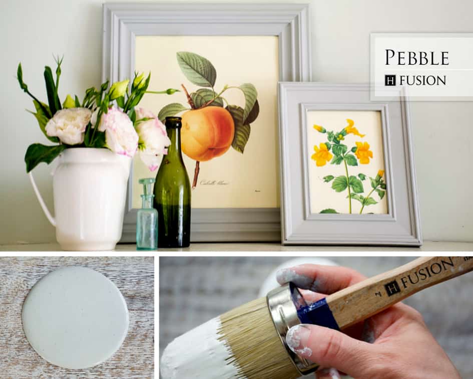
Pebble (Michael Penney Collection) – a chameleon colour with a couple of different undertones that often change with the lighting that is present in the room. soft hint of green, natural feel.
Cathedral Taupe – very subtle pink/purple undertones, not typically seen unless put side by side with white. By itself almost an off white/tan colour.
Bedford – green undertone, chameleon colour – can change in different lights: either a soft lighter grey or can bring out the green hugh.
Linen – rich depth reminiscent of natural linen, subtle green undertones
Algonquin – beige with pink undertones.
Putty (NEW 2016) – the perfect greige blend of grey & beige in a soft, light, neutral tone.
Note: this video does not contain the new colour, Putty.
Sterling
Pebble
Cathedral Taupe
Bedford
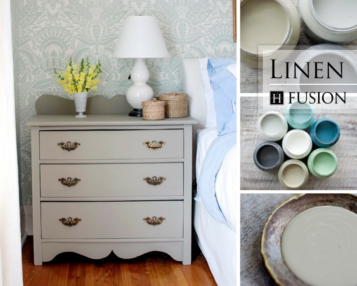
Linen
Algonquin

Putty
Blues:
Laurentian – blue & green undertones, a little more green. Throwback to the 50’s – a bright vibrant pastel green.
Heirloom (Michael Penney Collection) – pretty soft blue with green tones, also has a grey tone, creating more of a muddy green.
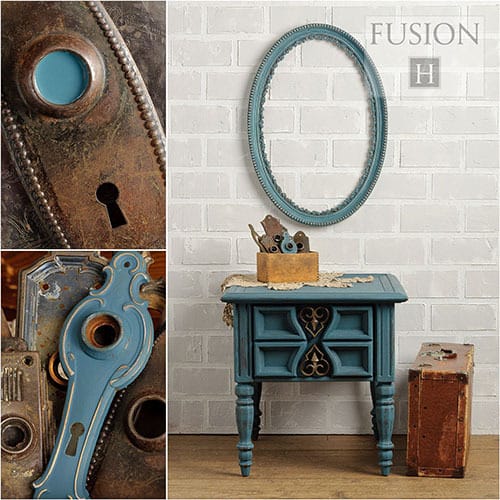
Inglenook – neutral blue with a grey/green
Renfrew Blue – a vibrant dark teal.
Seaside (Michael Penney Collection) – more of a true blue than others in the line. Undertones of grey, quite a darker blue.
Homestead Blue – similar to Seaside, but darker, greyer.
Champness – bright sky blue

Laurentien
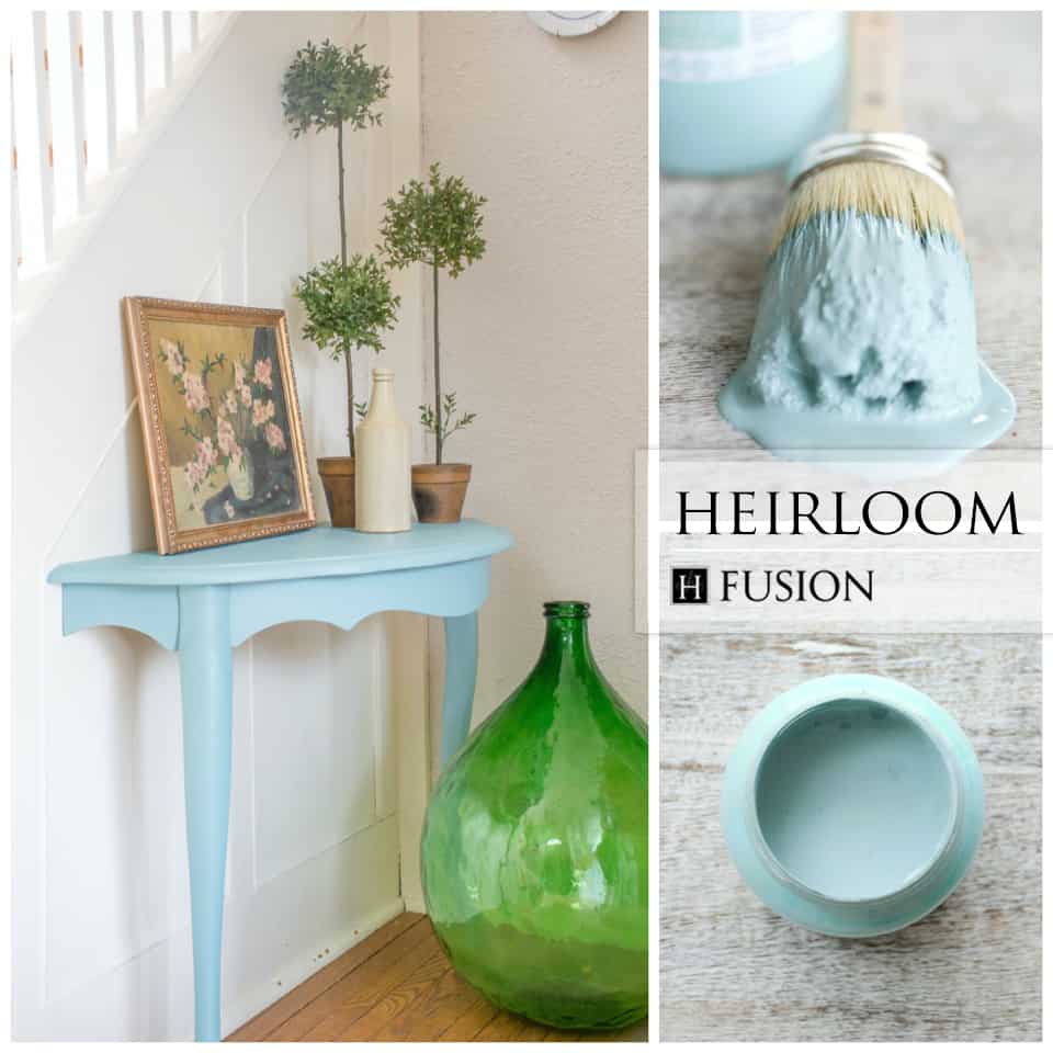
Heirloom
Inglenook
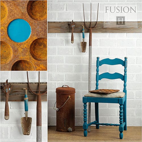
Renfrew Blue

Seaside
Homestead Blue

Champness
Deep Blues & Greys:
Liberty Blue – dark, true blue
Midnight Blue (NEW 2016) – A deep, dark blue with gray undertones
Homestead Blue – (also mentioned above in the last video)
Ash – charcoal grey
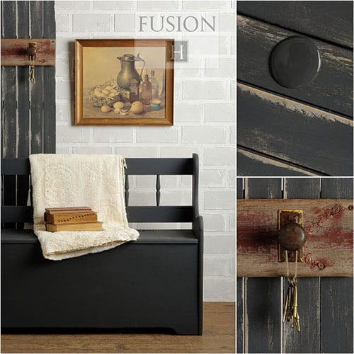
Coal Black – true jet black
Soapstone (Michael Penney Collection) – reminiscent of a true natural soapstone, dark grey. Has a slight blue undertone when dry.
Note: this video does not contain the new colour, Midnight Blue.
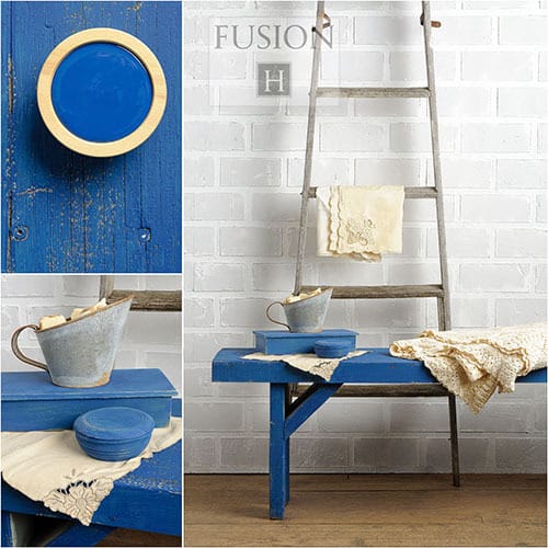
Liberty Blue
Homestead Blue
Ash
Coal Black
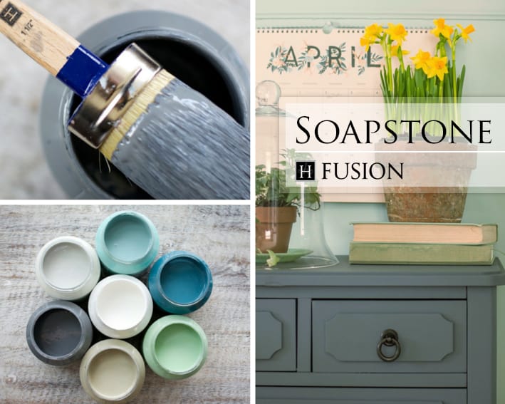
Soapstone
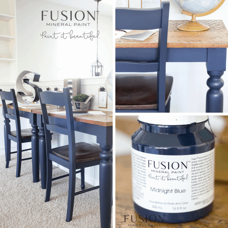
Midnight Blue
Greens:
Laurentian – a vintage green (also mentioned in the blue section above for its blue tones)
Aubusson (discontinued) – a yellow green that has a muddy tone
Upper Canada Green (discontinued) – vibrant green with a muddy undertone but more green than Aubusson.
Ceramic (discontinued) – vibrant bright green
Lilly Pond (Michael Penney Collection) – blue & green tones with raw umber pigment creating a muddy vintage green
Inglenook – (also mentioned in the blue section above) soft grey blue green pastel.
Bayberry (NEW 2016) – deep rich olive green.
Park Bench (NEW 2016) – dark, tree green
Lichen (NEW 2016) – a grey green, reminiscent of lichen in nature.
Note: this video does not contain the new colours, Bayberry, Park Bench or Lichen.
Laurentien

Aubusson

Upper Canada Green
Ceramic
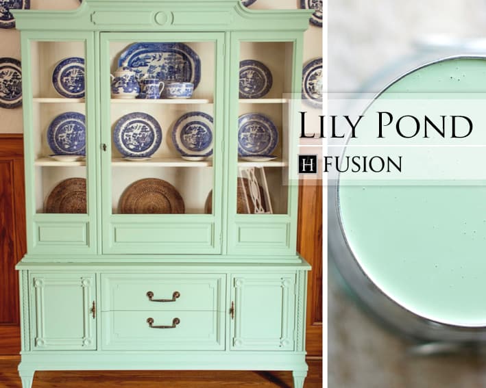
Lily Pond
Inglenook
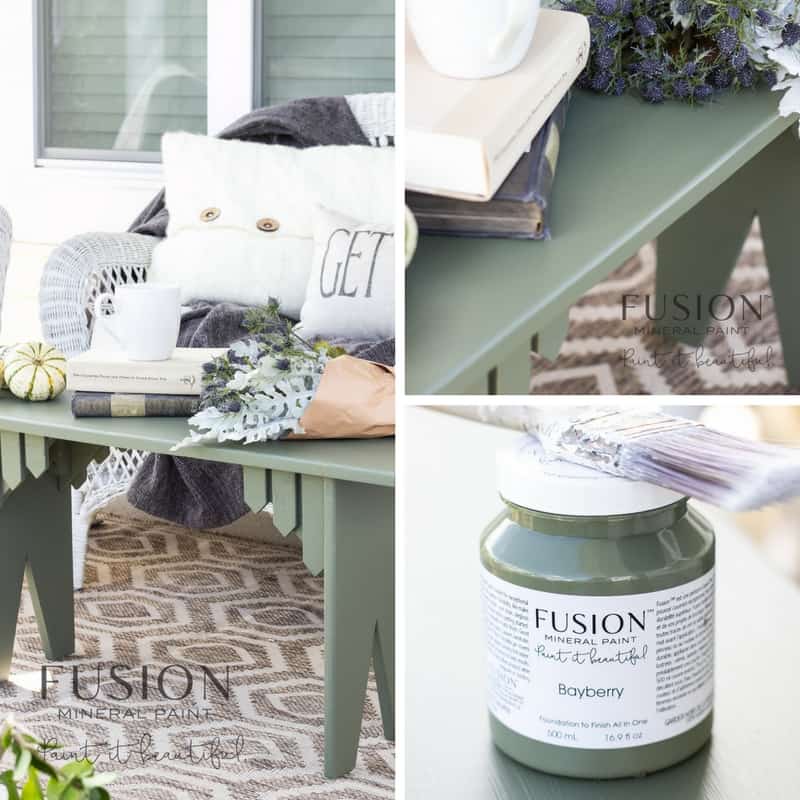
Bayberry

Park Bench
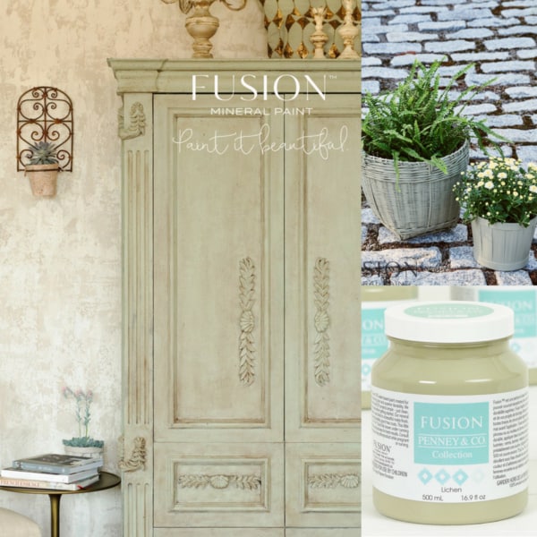
Lichen
So there you go, I hope you find the colour you are looking for – if not, you know that you can create your own custom colour by blending any of the colours together – colour mixing is fun! Experiment, be creative.
Here are some Custom Colour combinations to start you on your way (scroll to the bottom section, click on a colour you like and write down the colour combination needed to create the colour you’ve selected. You can purchase these colours from your local Fusion retailer).
NOTE: This is not a full comprehensive colour guide of all the Fusion colours. For more information and a guide to Fusion’s colour range visit Fusion’s colour chart here.
Happy Painting,
Sharon.