[soliloquy id=”10595″]
If you follow color trends, especially in the design world, you’ll know that Pantone has for the first time, released not one, but two colors of the year for 2016.
Introducing “Rose Quartz” and “Serenity”
Pantone 2016 Color of the Year
I wasn’t too fussed on last year’s color of the year – Marsala (a burgandy grape color), but I am loving the tones of these two pastels and how they blend beautifully together. Rose Quartz is “a warmer embracing rose tone” and Serenity is a “cooler tranquil blue”.
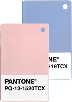
Pantone color swatches – Rose Quartz & Serenity
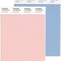
Pantone Fabric Swatches – Rose Quartz & Serenity
Pantone Color of the Year Around the Home
Here are some inspiration pics from around the web, using these colors. Click the pictures to head over to the original blog posts I sourced these from:
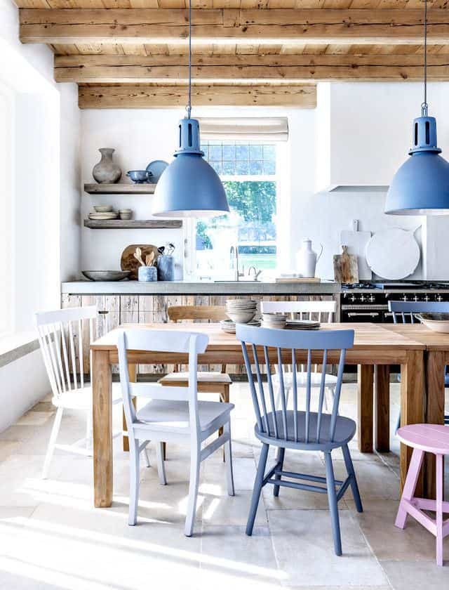
Image via Kitchen Studio of Naples, Inc.
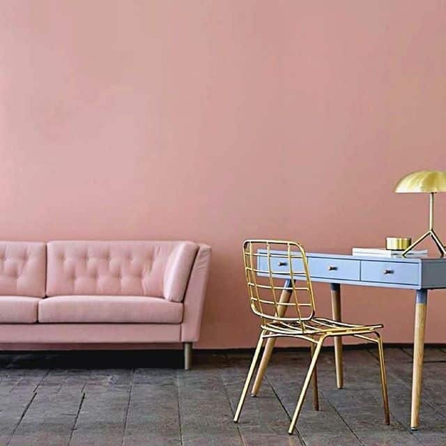
Photo via @eddiezs
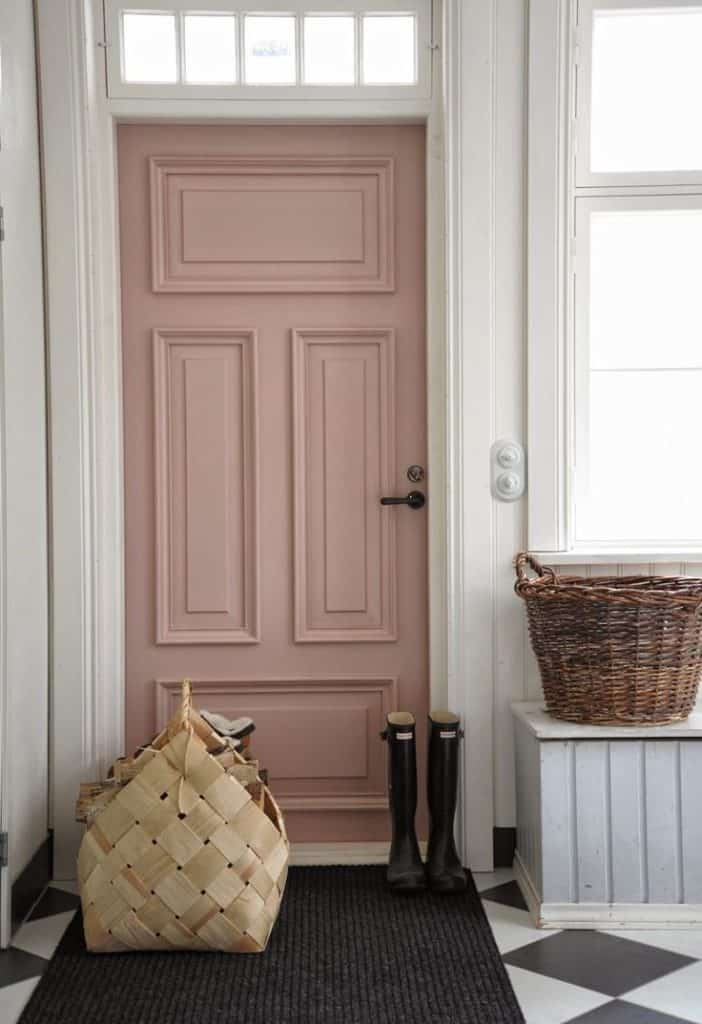
Photo via Blogarredamento.com
Photo via Design Milk. Click through to see where each item is from.
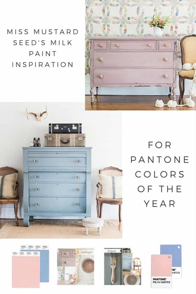
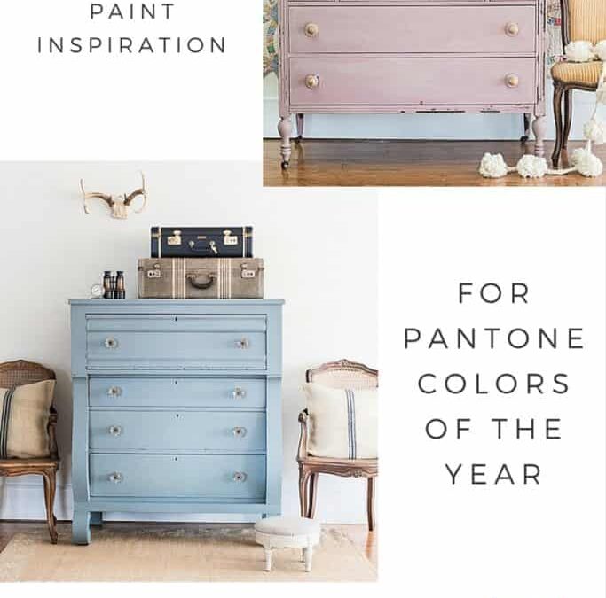
Miss Mustard Seed’s Milk Paint Inspiration
In our range of Miss Mustard Seed’s Milk Paint European collection, two colors stand out to me, to create a similar look for this Pantone color of the year vibe.
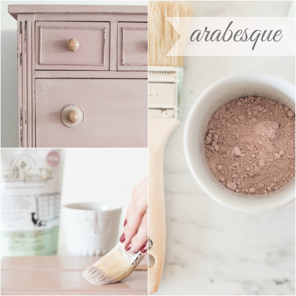
Arabesque:
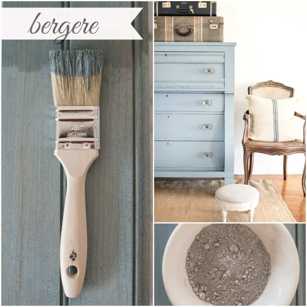
Bergere:
I think they’d look lovely together …
Miss Mustard Seed’s Milk Paint – Arabesque
Miss Mustard Seed’s Milk Paint – Bergere
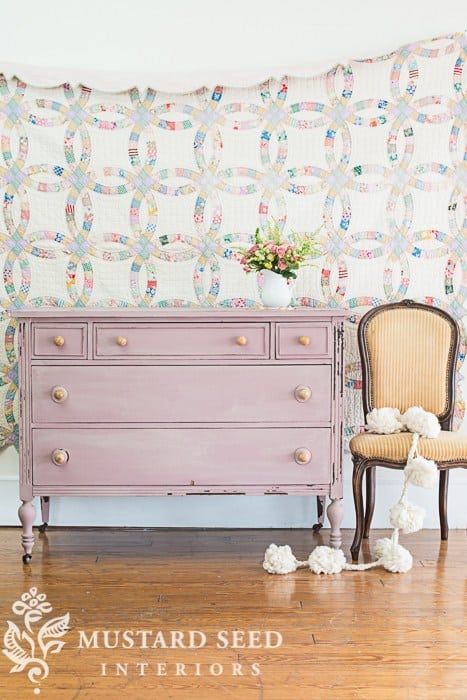
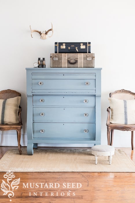
My Own Makeovers:
Here are some of my own furniture makeovers I have done in these colours:
Arabesque – Antique Drawers Up-cycled into Shelves
Bergere – Coffee Table with Gray-wash Wood Top
Bergere – A Tall Boy Drawer Set Transformed from Orange Pine
Colour Matching:
Now, I know the MMSMP colours are not exact matches to the Pantone colours, but you get the idea of creating inspiration for these pretty tones. If you wanted to color match more accurately, experiment a little with adding some other MMSMP colours into the mix. The Bergere could be a little more stronger blue to match Serenity – try adding some French Enamel, for example.
What do you think of these colors? Are you influenced by the changes in seasonal colour fashions, or do you prefer to stick to your own style and colour expressions?
I’d love you to comment below and subscribe for further updates, specials and promotions.
Happy 2016!
Sharon.
PS. You can share this image to your Pinterest board: